Wow, Quotes Showcase Widget Using Pure CSS3
Published on November 8, 2012
Hi guys how you doing? Its been long time we learn CSS3-WIDGET . Last post in CSS3-WIDGET section was How To Create Slide Show With Pure CSS3. Today its time to learn another CSS3-WIDGET. I will explain you how to create simple Quote Showcase widget using PURE-CSS3. You can also use this as Testimonials Showcase in your portfolio site. So lets jump in to see how its work.

How It Works
step1: In this example we will take three divs with the quote text and author name in it.
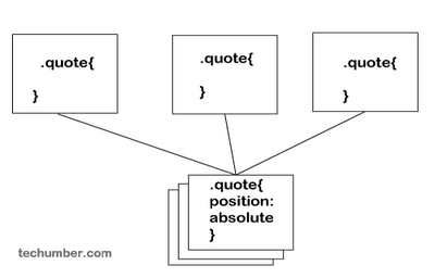
Step2: Make all these three divs css-position to absolute.(So that each div overlap on other divs).
Step3: Use CSS3 animation with keyframe to display only one div at time and loop it.  HTML
HTML
<div class="quote-wrapper">
  <div class="quote">
    <div class="text">
      "A man who was completely innocent, offered himself as a sacrifice for the
      good of others, including his enemies, and became the ransom of the world.
      It was a perfect act."
    </div>
    <div class="author">
      -Mahatma Gandhi -
    </div>
  </div>
  <div class="quote">
    <div class="text">
      "Never think there is anything impossible for the soul. It is the greatest
      heresy to think so. If there is sin, this is the only sin; to say that you
      are weak, or others are weak."
    </div>
    <div class="author">
      -Swami Vivekananda-
    </div>
  </div>
  <div class="quote">
    <div class="text">
      "The world is a dangerous place to live; not because of the people who are
      evil, but because of the people who don't do anything about it."
    </div>
    <div class="author">
      -Albert Einstein -
    </div>
  </div>
</div>
Under quote-wrapper we will take three quote divs. Style
.quote {
  position: absolute;
  overflow: hidden;
  opacity: 0;
  -moz-opacity: 0;
  filter: alpha(opacity=0);
  border: 1px solid #030303;
  background: url(img/pattern.png) repeat;
  padding-bottom: 0.5em;
  height: auto;
  width: 200px;
  overflow: hidden;
  -webkit-border-radius: 6px;
  -moz-border-radius: 6px;
  border-radius: 6px;
}
.quote .text {
  padding: 15px 15px 25px 15px;
  color: #fff;
  font-style: italic;
  font-weight: 100;
  zoom: 1;
  font-size: 1.25em;
}
.quote .author {
  display: block;
  padding: 0.5em;
  margin-top: 1em;
  border-top: 1px dotted #4d4d4d;
  color: #7a9f17;
  font-style: normal;
  font-size: 1em;
  font-size: 1.25em;
  margin-right: 15px;
}
@-webkit-keyframes "cycle" {
  0% {
    opacity: 0;
  }
  2% {
    opacity: 1;
  }
  31% {
    opacity: 1;
  }
  33% {
    opacity: 0;
  }
  100% {
    opacity: 0;
  }
}
.quote:nth-child(1) {
  -webkit-animation: cycle 15s 0s infinite linear;
}
.quote:nth-child(2) {
  -webkit-animation: cycle 15s 5s infinite linear;
}
.quote:nth-child(3) {
  -webkit-animation: cycle 15s 10s infinite linear;
}
In this we will use css3 animations with keyframes and change opacity at different levels of time. Read: How To Create Slide Show With Pure CSS3 for better understand how CSS3 animations work. This code only work in -webkit- browser. Use following code for cross browser support. Cross Browser compatible
/*cross browser animations*/
.quote:nth-child(1) {
  -webkit-animation: cycle 15s 0s infinite linear;
  -moz-animation: cycle 15s 0s infinite linear;
  -ms-animation: cycle 15s 0s infinite linear;
  -o-animation: cycle 15s 0s infinite linear;
  animation: cycle 15s 0s infinite linear;
}

.quote:nth-child(2) {
  -webkit-animation: cycle 15s 5s infinite linear;
  -moz-animation: cycle 15s 5s infinite linear;
  -ms-animation: cycle 15s 5s infinite linear;
  -o-animation: cycle 15s 5s infinite linear;
  animation: cycle 15s 5s infinite linear;
}

.quote:nth-child(3) {
  -webkit-animation: cycle 15s 10s infinite linear;
  -moz-animation: cycle 15s 10s infinite linear;
  -ms-animation: cycle 15s 10s infinite linear;
  -o-animation: cycle 15s 10s infinite linear;
  animation: cycle 15s 10s infinite linear;
}

/*croass browser keyframe anitmation*/
@keyframes "cycle" {
  0% {
    -ms-filter: "progid:DXImageTransform.Microsoft.Alpha(Opacity=0)";
    filter: alpha(opacity=0);
    opacity: 0;
  }
  2% {
    -ms-filter: "progid:DXImageTransform.Microsoft.Alpha(Opacity=100)";
    filter: alpha(opacity=100);
    opacity: 1;
  }
  31% {
    -ms-filter: "progid:DXImageTransform.Microsoft.Alpha(Opacity=100)";
    filter: alpha(opacity=100);
    opacity: 1;
  }
  33% {
    -ms-filter: "progid:DXImageTransform.Microsoft.Alpha(Opacity=0)";
    filter: alpha(opacity=0);
    opacity: 0;
  }
  100% {
    -ms-filter: "progid:DXImageTransform.Microsoft.Alpha(Opacity=0)";
    filter: alpha(opacity=0);
    opacity: 0;
  }
}

@-moz-keyframes cycle {
  0% {
    filter: alpha(opacity=0);
    opacity: 0;
  }
  2% {
    filter: alpha(opacity=100);
    opacity: 1;
  }
  31% {
    filter: alpha(opacity=100);
    opacity: 1;
  }
  33% {
    filter: alpha(opacity=0);
    opacity: 0;
  }
  100% {
    filter: alpha(opacity=0);
    opacity: 0;
  }
}

@-webkit-keyframes "cycle" {
  0% {
    filter: alpha(opacity=0);
    opacity: 0;
  }
  2% {
    filter: alpha(opacity=100);
    opacity: 1;
  }
  31% {
    filter: alpha(opacity=100);
    opacity: 1;
  }
  33% {
    filter: alpha(opacity=0);
    opacity: 0;
  }
  100% {
    filter: alpha(opacity=0);
    opacity: 0;
  }
}

@-ms-keyframes "cycle" {
  0% {
    -ms-filter: "progid:DXImageTransform.Microsoft.Alpha(Opacity=0)";
    filter: alpha(opacity=0);
    opacity: 0;
  }
  2% {
    -ms-filter: "progid:DXImageTransform.Microsoft.Alpha(Opacity=100)";
    filter: alpha(opacity=100);
    opacity: 1;
  }
  31% {
    -ms-filter: "progid:DXImageTransform.Microsoft.Alpha(Opacity=100)";
    filter: alpha(opacity=100);
    opacity: 1;
  }
  33% {
    -ms-filter: "progid:DXImageTransform.Microsoft.Alpha(Opacity=0)";
    filter: alpha(opacity=0);
    opacity: 0;
  }
  100% {
    -ms-filter: "progid:DXImageTransform.Microsoft.Alpha(Opacity=0)";
    filter: alpha(opacity=0);
    opacity: 0;
  }
}

@-o-keyframes "cycle" {
  0% {
    filter: alpha(opacity=0);
    opacity: 0;
  }
  2% {
    filter: alpha(opacity=100);
    opacity: 1;
  }
  31% {
    filter: alpha(opacity=100);
    opacity: 1;
  }
  33% {
    filter: alpha(opacity=0);
    opacity: 0;
  }
  100% {
    filter: alpha(opacity=0);
    opacity: 0;
  }
}
This code will work in all CSS3 support browsers. Reference w3schools-css3-animation That’s it hope you like it. Please Share it if you like. Thank you.